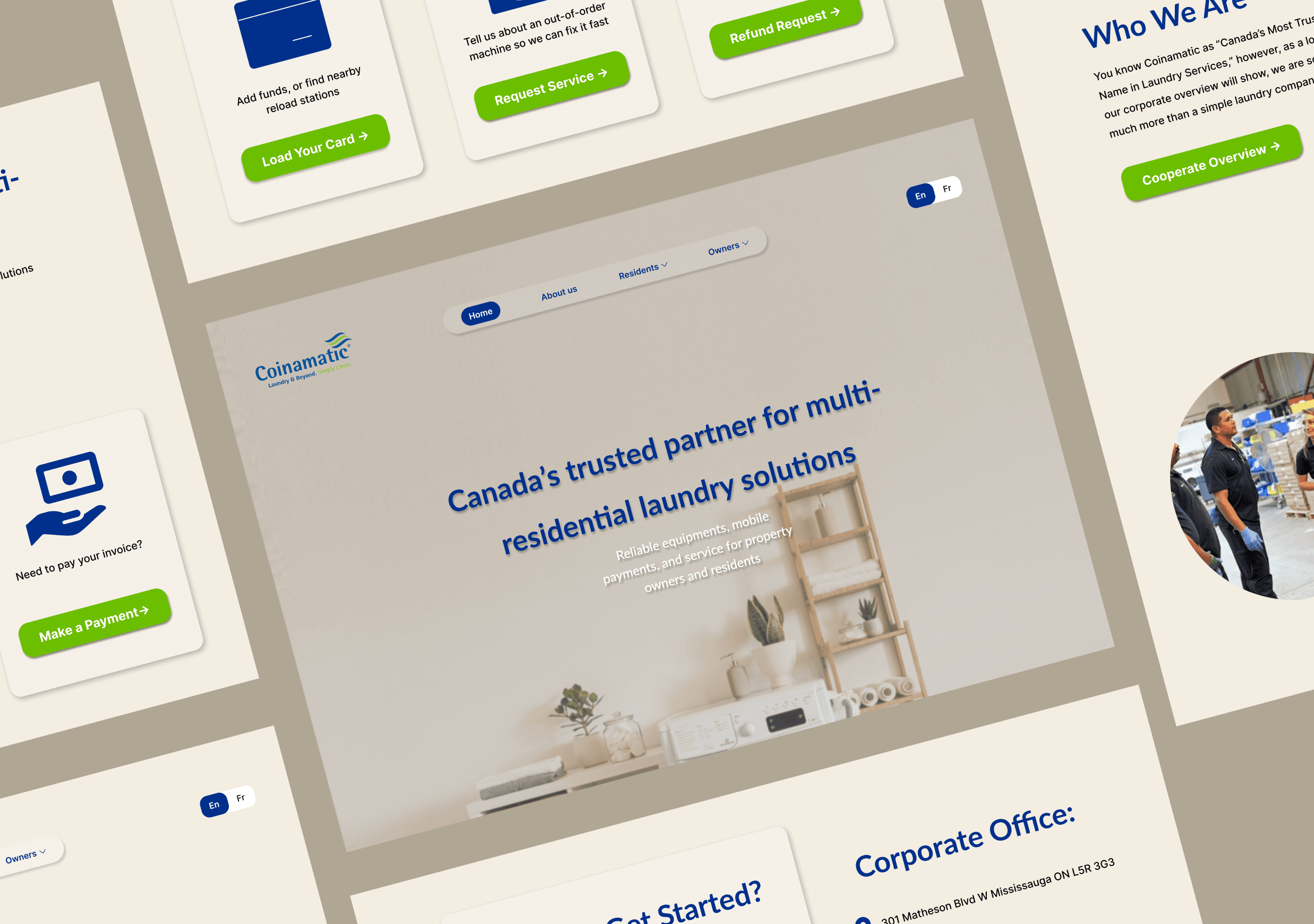
A UX/UI redesign concept for a laundry service website focused on improving navigation clarity, accessibility, and overall usability.
Coinamatic Web Redesign

Coinamatic
Project Type
Conceptual UX/UI Redesign
Project Timeline
1-2 weeks
My Role
UX/UI Designer
Tools
Figma
Overview
This conceptual redesign project focused on improving the usability, visual consistency, and clarity of an existing laundry service website. As the UX/UI designer, I analyzed the original experience, identified usability and navigation issues, and redesigned the interface to create a clearer, more intuitive experience, especailly for first-time users.
Problem
Although the original website followed a modern visual style and used recognizable brand colors such as navy blue and green, several usability and consistency issues still weakened the overall user experience.
Key problems included:
Poor readability: Machine detail pages used small, thin fonts, making important information difficult to read.
Inconsistent typography and color usage: Different pages applied varying font styles and title colors, breaking visual consistency across the site.
Inconsistent button design: Buttons with the same function appeared in different colors, sizes, corner radius, and text styles, which confused users.
Weak visual hierarchy: On pages such as the sustainability section, subtitles appeared nearly identical to main headings, reducing clarity.
Layout and spacing issues: Some sections felt crowded or misaligned, particularly toward the bottom of pages.
Unclear calls to action: Actions like “Get a Quote,” “Contact Us,” and “Request a Service” were not clearly distinguished, making it difficult for users to identify the next step.
Lack of onboarding content: The website did not clearly explain how the system works, leaving first-time users unsure of how to get started.
Limited responsiveness: The layout did not consistently adapt to different screen sizes, impacting usability on smaller devices.
Analysis
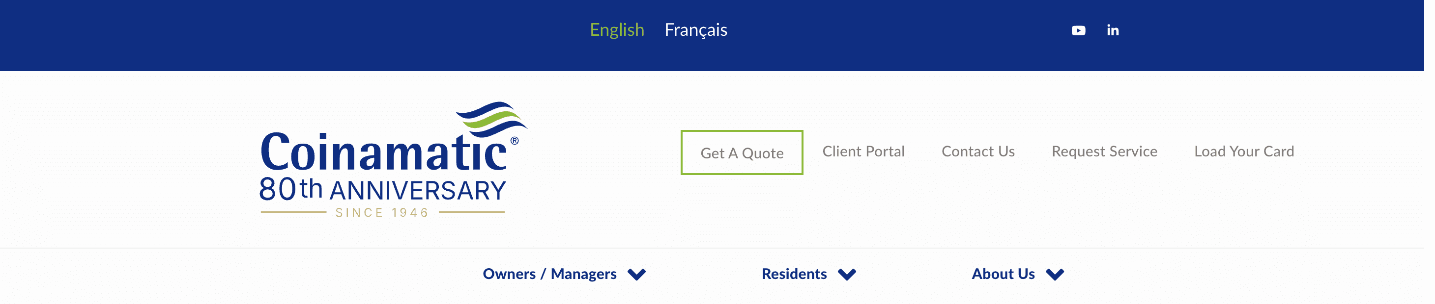
header of the original homescreen
Before starting, to better understand the website’s structure, priorities, and user needs, I conducted a focused analysis of:
The original navigation bar
Key service pathways
Quick-access actions and calls to action
My own experience as a resident user
From this research, I identified the following user groups:
• Residents
• Property owners / managers
Primary Users
• Career seekers
• Business partners
Secondary Users
Ideation
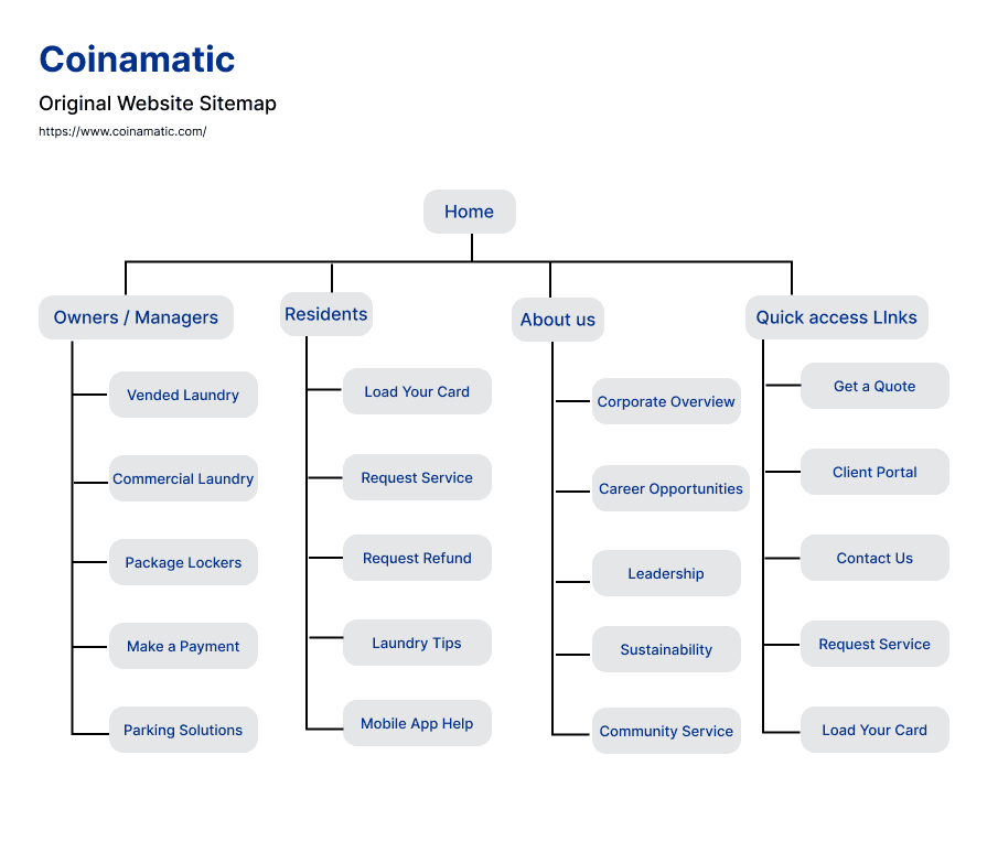
Original website sitemap
Redesigned website sitemap
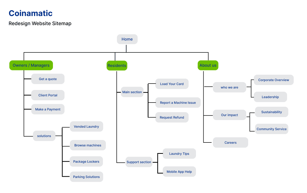
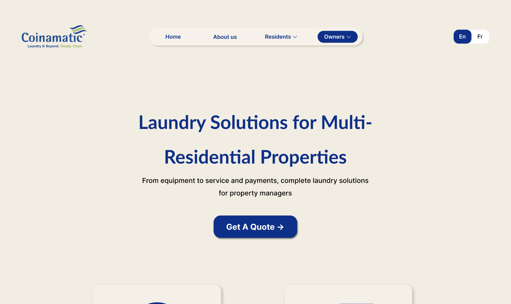
Instead of maintaining the original cluttered header structure, the redesign introduces a user-centered navigation system by organizing users into three distinct user groups based on the user analysis findings. This improves navigation clarity, reduces cognitive overload, and helps users access relevant information more efficiently.
Original Website header

redesigned Website header
Simplified Navigation Structure
Clearer User Segmentation
Better Space Utilization
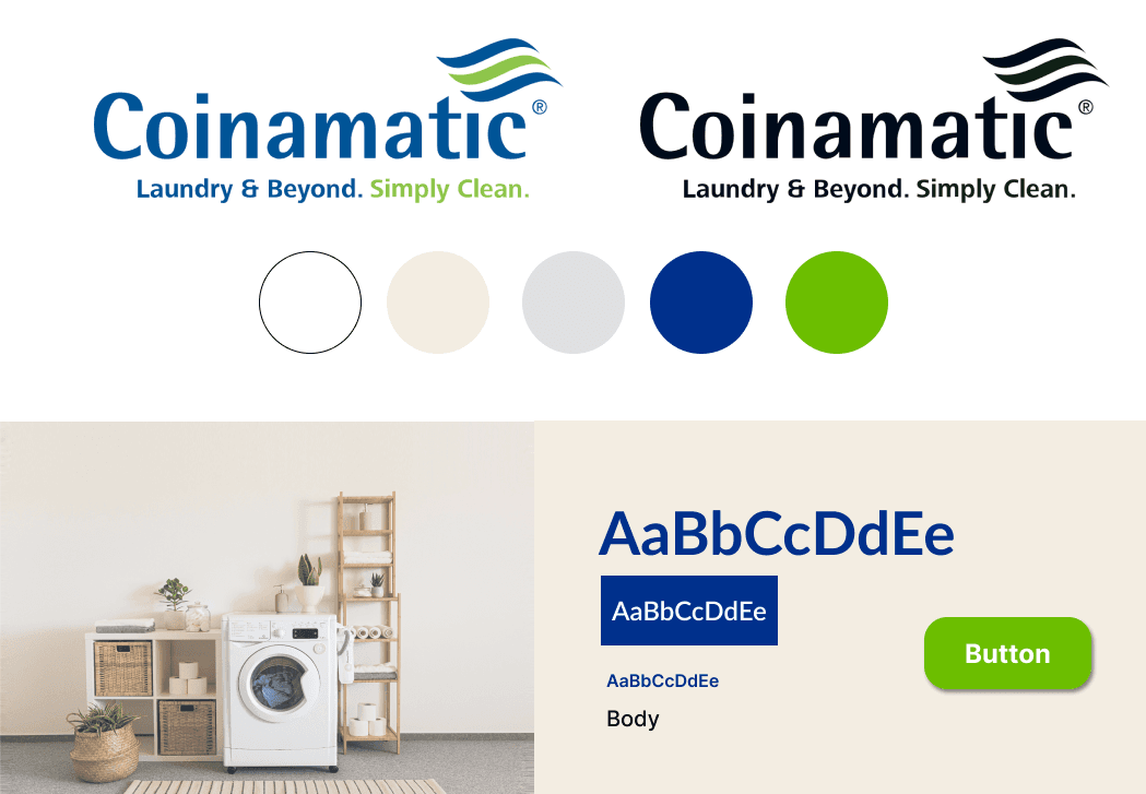
UI Consistency
To fix the inconsistent visual system, the redesign applies:
A consistent typography system
Unified button styles
Clean brand color usage
Improved line height, spacing, and alignment
UX Refinement
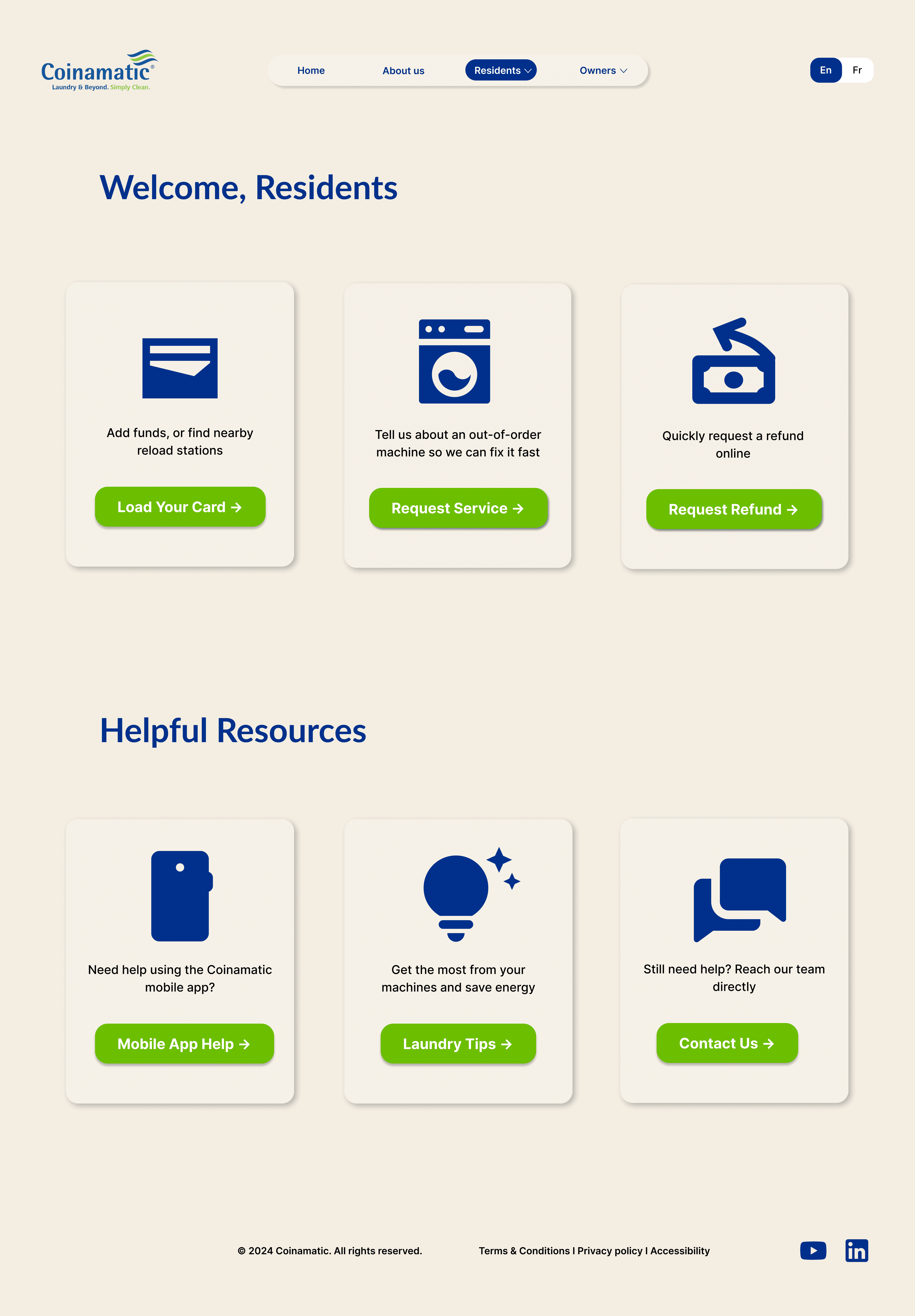
Grouped actions by user type for faster navigation.
Improved visual hierarchy to guide user attention more clearly.
Reduced cognitive load with a cleaner, simplified layout.
After
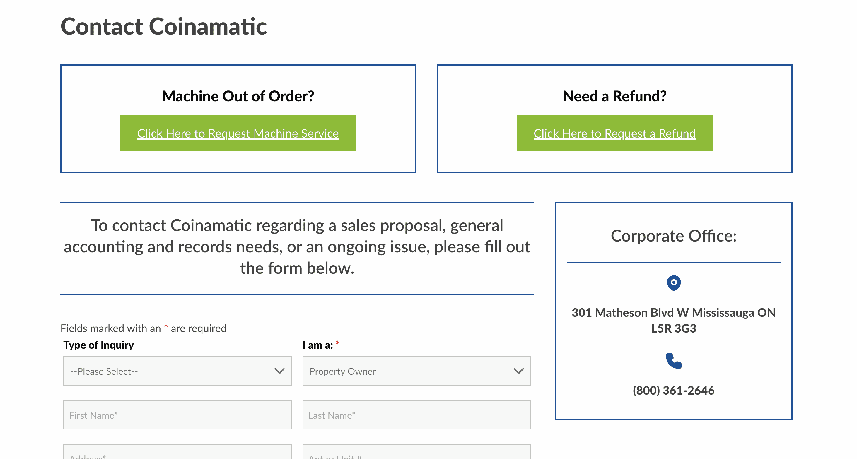
1. Too Many Competing Actions
On the Contact Us page, “Machine Out of Order?” and “Need a Refund?” visually dominate the main contact form, making it unclear where users should focus first.
Weak Visual Hierarchy
Blue borders, large empty boxes, and similar typography give all elements equal visual weight, making the page difficult to scan naturally.
3. Poor CTA Design
The green buttons feel outdated, with underlined text that resembles hyperlinks rather than modern call-to-action buttons.
Distracting Sidebar Section
The corporate office panel interrupts the main contact form experience.
Before
Beyond navigation restructuring, several system-level UX improvements were applied to improve accessibility, clarity, and user confidence across the website.
Bilingual toggle visibility
The EN/FR language switch was moved to the top-right corner to align with user expectations and improve discoverability.

Before: placed in the center, creating an awkward and unintuitive layout.
After: Moved to the top-right corner for a more familiar and intuitive experience.
Improved call-to-action placement:
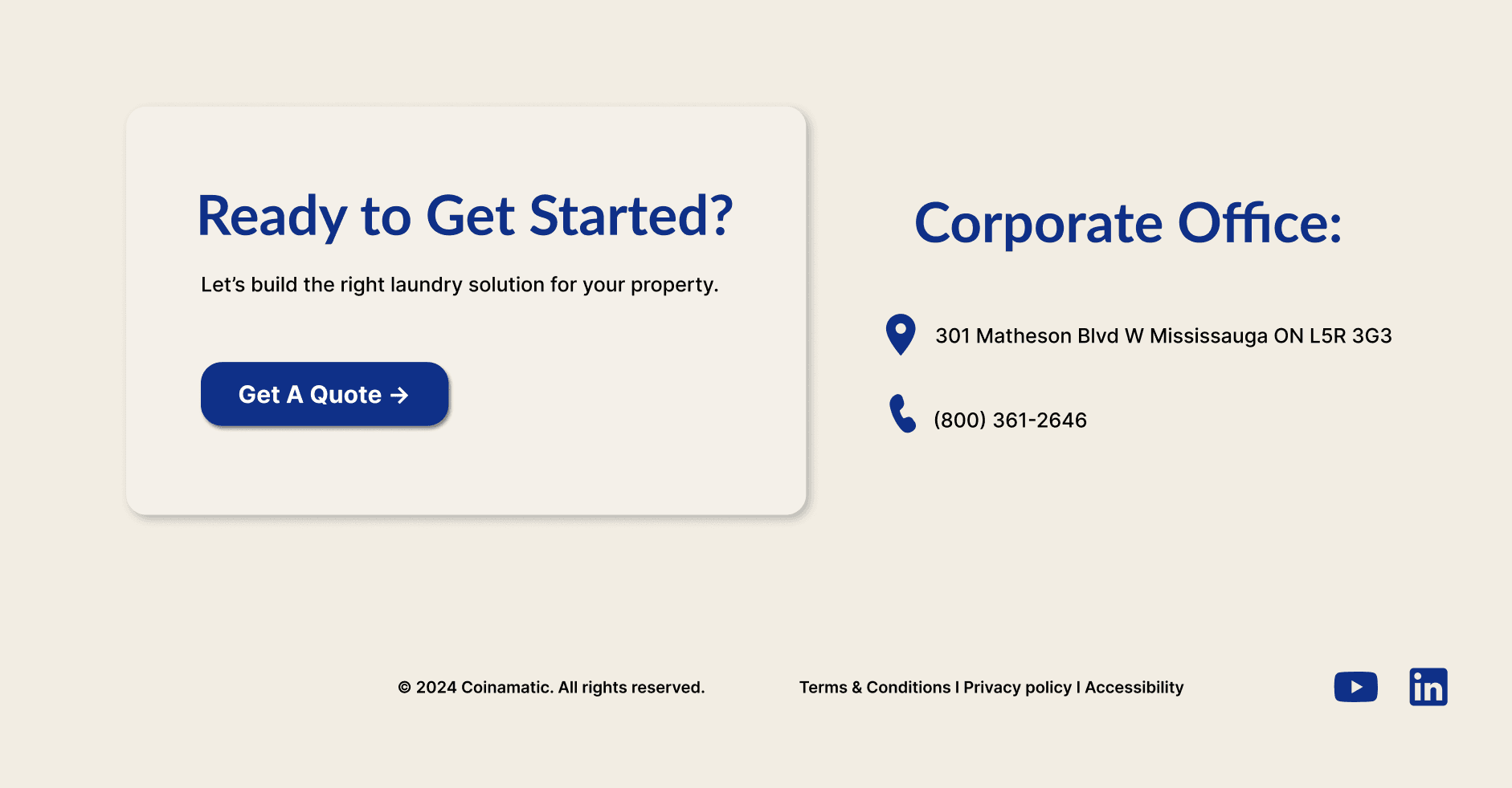
“Get a Quote” buttons were added at both the beginning and end of the owners’ page, allowing property owners and managers to contact the company at key decision points.
Enhanced footer information:
Full office contact details were added to the owners’ page footer to improve accessibility, trust, and transparency.
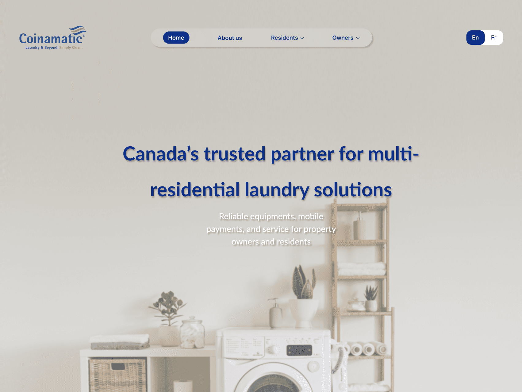
The original homepage attempted to serve all user groups at once, which resulted in an overwhelming and confusing navigation experience, particularly for new visitors.
I then restructured the homepage into two clear user path cards based on user intent:
One for Residents
One for Owners / Managers
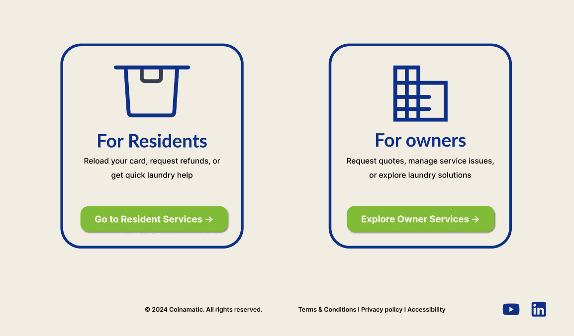
and each card includes:
A clear title
An identifiable icon
Supporting text
The most relevant features for that user type listed out
Overview
This conceptual redesign project focused on improving the usability, visual consistency, and clarity of an existing laundry service website. As the UX/UI designer, I analyzed the original experience, identified usability and navigation issues, and redesigned the interface to create a clearer, more intuitive experience, especailly for first-time users.
Problem
Although the original website followed a modern visual style and used recognizable brand colors such as navy blue and green, several usability and consistency issues still weakened the overall user experience.
Key problems included:
Poor readability: Machine detail pages used small, thin fonts, making important information difficult to read.
Inconsistent typography and color usage: Different pages applied varying font styles and title colors, breaking visual consistency across the site.
Inconsistent button design: Buttons with the same function appeared in different colors, sizes, corner radius, and text styles, which confused users.
Weak visual hierarchy: On pages such as the sustainability section, subtitles appeared nearly identical to main headings, reducing clarity.
Layout and spacing issues: Some sections felt crowded or misaligned, particularly toward the bottom of pages.
Unclear calls to action: Actions like “Get a Quote,” “Contact Us,” and “Request a Service” were not clearly distinguished, making it difficult for users to identify the next step.
Lack of onboarding content: The website did not clearly explain how the system works, leaving first-time users unsure of how to get started.
Limited responsiveness: The layout did not consistently adapt to different screen sizes, impacting usability on smaller devices.
Analysis
header of the original homescreen
Before starting, to better understand the website’s structure, priorities, and user needs, I conducted a focused analysis of:
The original navigation bar
Key service pathways
Quick-access actions and calls to action
My own experience as a resident user
From this research, I identified the following user groups:
• Residents
• Property owners / managers
Primary Users
• Career seekers
• Business partners
Secondary Users
Ideation
Original website sitemap
Redesigned website sitemap
Instead of maintaining the original cluttered header structure, the redesign introduces a user-centered navigation system by organizing users into three distinct user groups based on the user analysis findings. This improves navigation clarity, reduces cognitive overload, and helps users access relevant information more efficiently.
Original Website header
redesigned Website header
Simplified Navigation Structure
Clearer User Segmentation
Better Space Utilization
UI Consistency
To fix the inconsistent visual system, the redesign applies:
A consistent typography system
Unified button styles
Clean brand color usage
Improved line height, spacing, and alignment
UX Refinement
Grouped actions by user type for faster navigation.
Improved visual hierarchy to guide user attention more clearly.
Reduced cognitive load with a cleaner, simplified layout.
After
1. Too Many Competing Actions
On the Contact Us page, “Machine Out of Order?” and “Need a Refund?” visually dominate the main contact form, making it unclear where users should focus first.
Weak Visual Hierarchy
Blue borders, large empty boxes, and similar typography give all elements equal visual weight, making the page difficult to scan naturally.
3. Poor CTA Design
The green buttons feel outdated, with underlined text that resembles hyperlinks rather than modern call-to-action buttons.
Distracting Sidebar Section
The corporate office panel interrupts the main contact form experience.
Before
Beyond navigation restructuring, several system-level UX improvements were applied to improve accessibility, clarity, and user confidence across the website.
Bilingual toggle visibility
The EN/FR language switch was moved to the top-right corner to align with user expectations and improve discoverability.
Before: placed in the center, creating an awkward and unintuitive layout.
After: Moved to the top-right corner for a more familiar and intuitive experience.
Improved call-to-action placement:
“Get a Quote” buttons were added at both the beginning and end of the owners’ page, allowing property owners and managers to contact the company at key decision points.
Enhanced footer information:
Full office contact details were added to the owners’ page footer to improve accessibility, trust, and transparency.
The original homepage attempted to serve all user groups at once, which resulted in an overwhelming and confusing navigation experience, particularly for new visitors.
I then restructured the homepage into two clear user path cards based on user intent:
One for Residents
One for Owners / Managers
and each card includes:
A clear title
An identifiable icon
Supporting text
The most relevant features for that user type listed out